
The Basics
Anytime you are involved in a creative or visual craft, having a good understanding of color relationships is a foundation that you will appreciate over and over again. Color is all around us. It has the ability to affect our mood, it can make us feel energized, it can make us sleepy, it can make us hungry, and yes, it can even effect our knitting and crocheting. The study of color is complex and can sometimes feel overwhelming, but getting comfortable with the basics will empower you to create stunning sweaters, hats, mittens, and so much more.
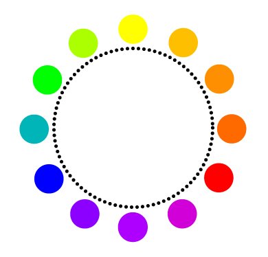
Here is a basic color wheel that includes the primary colors – yellow, blue, and red – along with secondary and tertiary colors. Although only twelve colors are shown, this basic color wheel can go a long way in translating color relationships. More advanced color wheels also include a large range of these basic colors in different hues and shades.
Primary Colors
First, let’s take a look at the primary colors in the color wheel. As I mentioned above, the primary colors are yellow, blue, and red. These three colors are then the basis for the remaining set of colors and are the only colors that cannot be reproduced by mixing other colors together.
Secondary Colors
Next up, you will find the secondary colors. These are the colors that are produced when mixing yellow with blue (bright green), yellow with red (orange), and blue with red (purple).
Tertiary Colors
Finally, the remaining colors come from mixing one of the primary colors with a secondary color to its left and right. These colors are known as tertiary colors because they are the third combination of colors that can be created.

For example, the bright green secondary color is mixed with the primary blue color to create the teal color shown in the tertiary color wheel above.
Color Combination
Understanding the basic relationships between colors will come in handy when you are looking to create colors that work together as well as color themes. And lucky for you, chances are that if you are reading this, you probably happen to knit and/or crochet. And what is yarn all about? Color! Aside from fiber and the tactile sensation of yarn, imagine standing in front of a table lined up with different colors of yarn. You will most likely gravitate towards a yarn first and foremost due to color, then, reach for it to see if you like the feel. It is that same gravitational pull towards a particular color that you can use as the starting point for finding colors that work well alongside it.
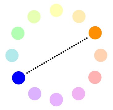
Complementary Colors
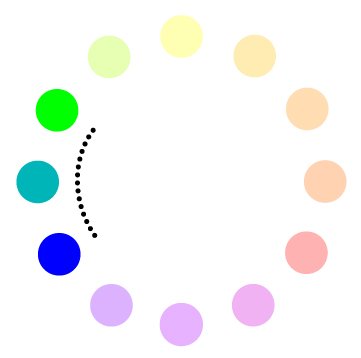
A simple start to finding a color combination is to begin with colors located opposite of one another on the wheel. In the case of colors (just like people), opposites attract! These color combinations are known as complementary colors and can bring about some unique and unexpected combinations that you just might love. Sometimes it takes a bit of experimentation by moving one of your colors choices to the left or right. And don’t forget to play around with changing up the shade or hue of your color choices for even more combinations.
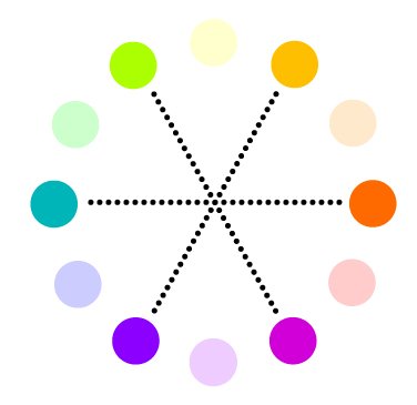
Split-Complementary Sets
If you are looking for a combination of three colors, you might try looking at different split-complementary sets. This variation branches out of the complementary colors theme. Begin as you would for choosing two complementary colors. Then, choose one of the colors to split out into the two colors located on either side. These split-complementary colors are wonderful because they still offer a lot of brightness and vibrancy of the complementary colors, but with a little more breathing room for the colors all around.
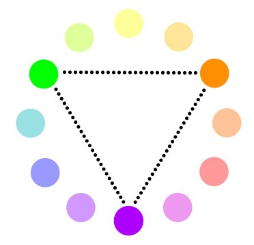
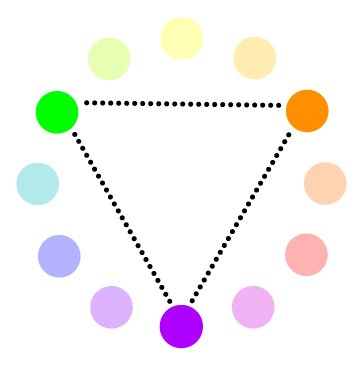
Triad Colors
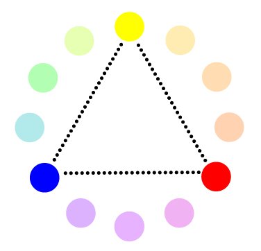
Another way of selecting a set of three colors is to opt for the triad. In this set, you simply choose three colors that are evenly spaced apart on the color wheel. Triad color sets tend to work well when you are looking for something that is well balanced but still very colorful. The triad approach also works well if you are looking to use lighter or less saturated colors and want to keep somewhat of a sense of contrast within your color set.
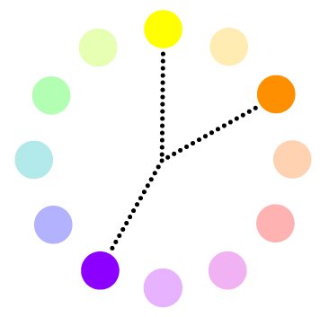
Analogous Colors
Last but not least, you can create stunning color combinations by using analogous colors. These are simply colors that are located next to each other on the color wheel. Analogous colors are great for when you do not want a lot of contrast – together, analogous colors tend to create more soothing and calm color palettes than the other sets listed above. You could easily experiment with more than three colors using this approach to create a gradiated color effect. Alternately, you could choose a complementary color opposite your set of analogous colors to work a pop of color into your design.